

Why Your Website Must Work on Phones {#why-mobile-matters}
Your website is like your business card. But it’s also your office and your salesperson.
Here’s a big fact: 6 out of 10 people use their phones to browse websites. If your site looks bad on phones, you lose clients.
What Happens When Sites Don’t Work on Phones

I know a designer who had this problem. Her website looked great on computers. But on phones:
- The text was too small to read
- Buttons didn’t work right
- Pages took forever to load
- Clients left her site right away
Don’t let this happen to you. Making your site work on phones is easier than you think.
10 Easy Steps to Fix Your Site {#easy-steps}
Step 1: Think Phone First
Most people design for computers first. Then they try to make it work on phones. This is backwards.
Do this instead:
- Start with phone screens
- Make sure everything works well
- Then make it work on bigger screens
Bonus: Google looks at your phone site first when ranking you in search results.
Step 2: Pick the Right Website Builder
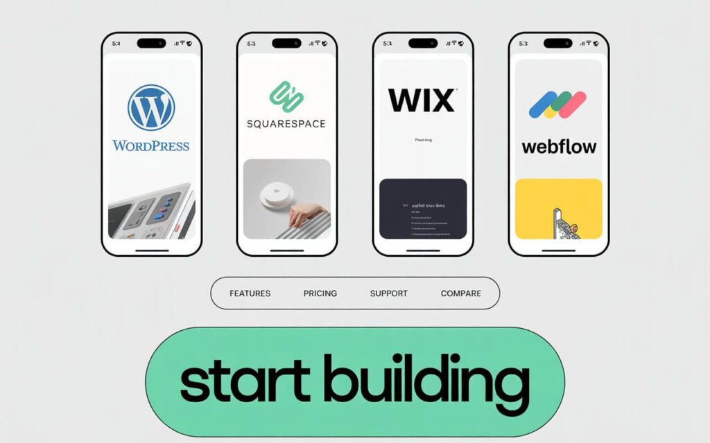
Your choice here matters a lot.
Good options:
- WordPress – Most flexible, lots of themes
- Squarespace – Easy to use, looks professional
- Wix – Drag and drop, very simple
- Webflow – More control, still easy
Important: Always test how themes look on your phone before you buy.
Step 2: Select the Right Platform and Theme
Your content management system (CMS) choice directly impacts mobile performance.
Top recommendations for freelancers:
| Platform | Best For | Key Features |
|---|---|---|
| WordPress | Maximum flexibility | Responsive themes (Astra, GeneratePress) |
| Squarespace | Design simplicity | Built-in mobile optimization |
| Wix | Drag-and-drop ease | Mobile editor included |
| Webflow | Advanced control | Code-free responsive design |
Pro Tip: Always test theme demos on your smartphone before purchasing.
Step 3: Make Navigation Simple
People use their thumbs on phones. This is different from using a mouse.
What to do:
- Use a menu button (three lines)
- Make buttons big enough to tap easily
- Give buttons space between them
- Don’t use tiny links
Step 4: Fix Your Images
Big images kill phone websites. Even pretty sites won’t work if they load slowly.
How to fix images:
- Make images smaller with free tools
- Use newer image types that load faster
- Only load images when people scroll to them
- Don’t put huge images everywhere
Step 5: Make Your Site Load Fast
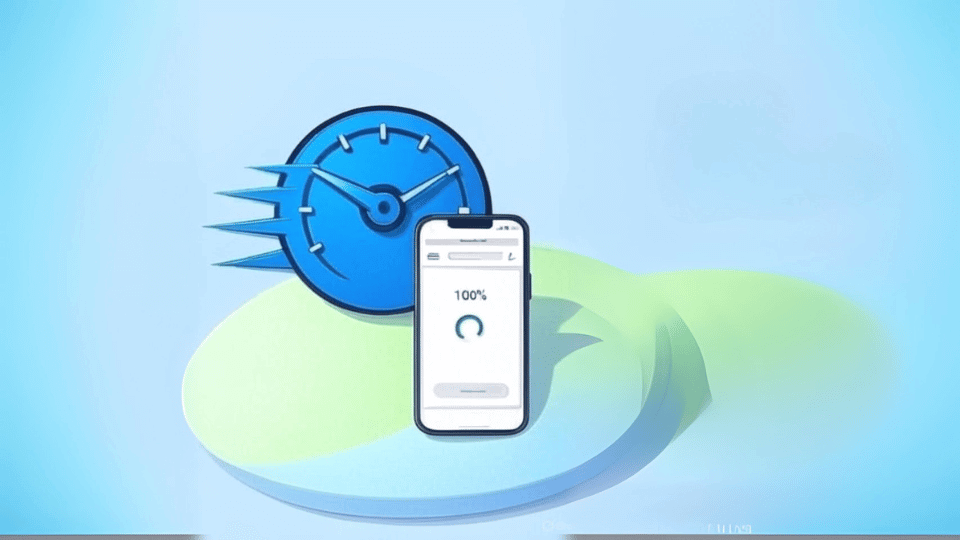
This is huge. More than half of people leave sites that take longer than 3 seconds to load.
Speed up your site:
- Use a service that makes sites load faster worldwide
- Clean up your code
- Pay for good website hosting
- Turn on caching
- Remove things you don’t need
Step 6: Make Text Easy to Read
Your words should be easy to read on any screen size.
Reading tips:
- Use big enough text (at least 16px)
- Keep paragraphs short
- Use dark text on light backgrounds
- Give text room to breathe
- Break up long sections
Step 7: Make Everything Easy to Tap
Your site should feel natural on phones.
Touch-friendly tips:
- Make buttons big enough
- Put space between clickable things
- Make forms work well on phones
- Give feedback when people tap things
- Don’t use hover effects that only work with mice
Step 8: Test on Real Phones
Don’t just test on your computer. Use real phones.
How to test:
- Use your own phone
- Try it sideways and upright
- Ask friends to test on their phones
- Test on both iPhones and Android phones
- Use Google’s mobile test tool
Step 9: Help People Find Your Site
A beautiful site is useless if no one can find it.
Help search engines:
- Write good page titles with keywords
- Write descriptions that make people want to click
- Use headings to organize your content
- Don’t block content with pop-ups
- Make sure your location is clear if you work locally
Step 10: Keep Your Site Updated
Your site needs regular care.
Do this every 3 months:
- Check how fast your site loads
- Update your portfolio with new work
- Fix any broken links
- Test on new phones
- Check your search rankings
What Not to Do {#mistakes}
Big mistakes that hurt your site:
- Using themes that don’t work on phones
- Putting too much stuff on your homepage
- Ignoring how fast your site loads
- Making buttons too small to tap
- Not testing on real phones
- Forgetting about search engine optimization
- Using old technology
- Making navigation too complicated
- Creating forms that are hard to fill out on phones
- Hiding your contact information
Extra Tips {#pro-tips}
💡 Make Your Site Feel Premium
Want to stand out? Add these touches:
- Nice fonts that look good on phones
- Small animations that aren’t too heavy
- Smooth scrolling effects
- Professional colors and styling
🚀 Advanced Tricks
For when you’re ready to go further:
- Make pages that load super fast
- Add features that make your site feel like an app
- Optimize for voice search
- Add a chat feature for instant contact
- Track how people use your mobile site
Your Mobile Site Works While You Sleep
When you make a great mobile website, you’re not just making something pretty. You’re building a tool that:
- Gets you clients 24/7
- Shows off your skills
- Makes it easy for people to hire you
- Works on any device
Start today:
- Think mobile first
- Make it fast and easy to use
- Keep testing and improving
Your next client might find you on their phone right now.
Common Questions {#faqs}
Why do freelancers need mobile-friendly websites?
Most people use phones to browse the web now. Google also ranks mobile-friendly sites higher in search results.
How do I know if my site works well on phones?
Use Google’s mobile-friendly test. Also check your site on different phones yourself.
Do I need to know how to code?
No. Website builders like WordPress, Wix, and Squarespace make mobile-friendly sites without coding.
How often should I update my website?
Check your site every 3 months. Make sure it’s fast, works well, and shows your latest work.
What’s the fastest way to make my site load faster on phones?
Start with these: make images smaller, use a content delivery network, and get better web hosting.
Should I make a separate mobile site?
No. Use responsive design instead. This means one site that works well on all devices.
How important is mobile speed for getting found online?
Very important. Google uses page speed to rank sites. Slow sites also make people leave quickly.
What if my current site doesn’t work on phones?
You have options. You can switch to a mobile-friendly theme, redesign your site, or hire someone to help fix it.