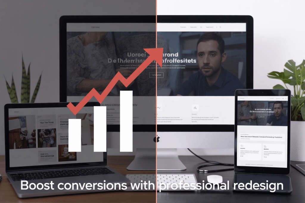
Is your website failing to turn visitors into customers? Business owners and marketing managers struggling with low conversion rates often overlook their outdated website design as the culprit. A professional website redesign service can transform your digital storefront into a conversion machine.
In this guide, we’ll show you clear signs that your website needs a redesign, how conversion-focused design elements can dramatically improve user experience, and the step-by-step process professional designers use to revamp underperforming websites.
Signs Your Website Needs a Redesign:

A. Declining Conversion Rates and Sales
Your website’s main job? Making you money. When that stops happening, you’ve got a problem.
Look at your analytics. See those downward-sloping conversion lines? That’s your website waving a red flag at you.
Most business owners blame their product or pricing when sales drop. But often, it’s your outdated website turning visitors away before they even see what you’re selling.
Customers expect smooth, intuitive experiences. If your site feels clunky compared to your competitors, they’ll bounce faster than you can say “shopping cart.”
B. High Bounce Rates
Nobody likes to see it, but there it is in your analytics: visitors landing on your page and immediately hitting the back button.
High bounce rates (anything above 70% for most industries) scream that something’s wrong. Your visitors came looking for something and decided within seconds that they won’t find it with you.
Maybe your navigation is confusing. Maybe your content doesn’t match what they expected. Or maybe—and this happens more than you’d think—your site just looks sketchy.
C. Outdated Visual Design
We all know that site from 2009 when we see it. The tiny text. The cheesy stock photos. The rainbow of competing colors.
Your website design has an expiration date, and it’s shorter than you think.
Design trends evolve quickly, and a site that looked modern three years ago can now make your brand seem behind the times. Customers make split-second judgments about your credibility based on appearance alone.
When your competitors all have sleek, contemporary designs while yours is still rocking gradients and drop shadows, you’re losing business without realizing it.
D. Poor Mobile Responsiveness
Pull out your phone and load your website. Be honest—does it look terrible?
Over 60% of web traffic now comes from mobile devices. If your site doesn’t adapt perfectly to different screen sizes, you’re alienating most of your potential customers.
Signs of poor mobile design include:
- Text that’s too small to read without zooming
- Buttons placed too close together
- Images that don’t resize properly
- Forms that are impossible to complete on a small screen
- Horizontal scrolling (the ultimate mobile sin)
E. Slow Loading Times
Three seconds. That’s how long most users will wait before abandoning your site.
Every additional second of load time decreases conversions by about 7%. That’s not a small problem—it’s a business killer.
Common culprits include:
- Unoptimized images
- Too many plugins
- Outdated coding practices
- Cheap hosting
Your beautiful website doesn’t matter if nobody sticks around to see it. Speed isn’t just a technical issue—it’s a revenue issue.
Benefits of Professional Website Redesign:

Enhanced User Experience
When a website feels clunky and outdated, visitors bounce faster than you can say “homepage.” Professional redesigns fix this by creating intuitive navigation that just makes sense.
Think about it: clear menus, logical page layouts, and buttons that actually look clickable. These aren’t just nice-to-haves—they’re the difference between a visitor staying or leaving.
Mobile responsiveness isn’t optional anymore. Your redesigned site will automatically adjust to look stunning on phones, tablets, and desktops. No more pinching and zooming just to read your content.
Page speed matters too. A professional redesign eliminates bloated code and optimizes images so your site loads in seconds, not minutes.
Improved Brand Perception
Your website is often the first impression people get of your business. A dated design screams “we don’t really care” while a fresh, modern look signals that you’re serious about quality.
Colors, typography, and imagery work together in a professional redesign to create a consistent brand experience that sticks in visitors’ minds.
Higher Conversion Rates
A professional redesign strategically places call-to-action buttons where users naturally look. No more hiding your “Buy Now” button in a corner where nobody sees it.
Smart form design reduces friction. Instead of asking for 15 fields of information, redesigned forms capture just what’s needed, making conversions significantly more likely.
Trust signals—testimonials, security badges, and guarantees—get prominent placement in a redesign, addressing customer concerns before they become objections.
Better SEO Performance
Outdated websites often have structural issues that search engines hate. A redesign builds proper site architecture from the ground up.
Mobile-friendliness directly impacts your search rankings now. Google prioritizes mobile-responsive sites, giving your redesigned website a ranking advantage.
Page speed improvements from a redesign directly boost SEO, as Google favors faster-loading websites in search results.
Key Elements of Conversion-Focused Design:
A. Strategic Call-to-Action Placement
Your website can look amazing, but if nobody clicks those buttons, you’re just showing off pretty graphics.
The secret? Put CTAs where people will actually see them. Above the fold is non-negotiable—visitors need to spot a clear action step within seconds of landing on your page.
But don’t stop there. Sprinkle CTAs throughout your content when interest peaks. Just finished explaining how your service solves a pain point? That’s your moment to drop a “Get Started” button.
Color matters too. Your CTA should pop against your background—not blend in like a chameleon on vacation. Think contrasting colors that grab attention without burning retinas.
B. Intuitive Navigation Structure
Nobody enjoys playing detective on your website. If visitors can’t find what they’re looking for in 3 clicks or less, they’re gone.
Keep your menu simple. Those mega-dropdowns with 47 options? They’re conversion killers. Stick to clear categories that guide users exactly where they need to go.
A solid breadcrumb trail shows users where they are and how to get back. It’s like those pebbles in Hansel and Gretel, except nobody gets eaten by a witch at the end of the customer journey.
C. Trust-Building Elements
Trust isn’t optional—it’s the backbone of conversions.
Real customer testimonials (with real names and photos) work wonders. Add client logos if you’ve worked with recognizable brands. People trust what others trust.
Security badges aren’t just decorative. That little lock icon or “Secure Payment” badge can be the difference between a completed checkout and an abandoned cart.
And transparency about pricing? Absolute must. Hidden fees are the fastest way to torpedo trust.
D. Optimized Page Load Speed
Three seconds. That’s all you’ve got before visitors bounce from a slow-loading page.
Compress those massive images. Yes, they look gorgeous at full resolution, but nobody’s framing your website. They just want information without waiting for their coffee to grow cold.
Minimize HTTP requests by combining files where possible. Each external script is another potential delay in your conversion pipeline.
Consider a content delivery network (CDN) if you’re targeting global traffic. Geography shouldn’t determine how quickly someone can convert.
E. Mobile-First Approach
More than half your visitors are probably on mobile devices. Ignoring this is leaving money on the table.
Make sure those thumb-sized buttons are actually thumb-sized. Nothing kills conversions faster than visitors zooming in just to avoid clicking the wrong thing.
Simplify forms for mobile users. Nobody’s filling out 15 fields on a smartphone while waiting for the bus. Each field you remove potentially increases conversion rates.
Test everything on actual devices. Simulators lie. What looks fine in your desktop browser preview might be a nightmare on an actual phone.
The Website Redesign Process:

A. Comprehensive Website Audit
Ever looked at your website and felt something was off but couldn’t pinpoint it? That’s why we start with a thorough audit. We dig into everything—your site structure, content quality, user experience, loading speeds, and mobile responsiveness.
Most site owners are shocked when they see the data. Your bounce rates might be through the roof because pages load too slowly. Or maybe your checkout process has hidden friction points sending customers running.
During the audit, we’ll:
- Analyze your traffic patterns
- Identify technical issues
- Evaluate your content effectiveness
- Check competitive positioning
- Review your conversion funnels
B. Strategic Planning and Goal Setting
Nobody redesigns a website “just because.” You need clear goals. Want to boost sales by 30%? Increase newsletter signups? Reduce support tickets?
We’ll sit down together and map out exactly what success looks like. This isn’t fluffy talk—we’re talking concrete metrics we can track.
Your goals shape everything that follows. If you’re chasing higher conversion rates, we’ll focus on streamlining the customer journey. Need better engagement? Content hierarchy becomes our priority.
C. Wireframing and Prototyping
This is where your new site starts coming to life.
Think of wireframes as the blueprint of your house before the interior designers arrive. No colors or fancy fonts yet—just the skeleton of your site’s layout and functionality.
We’ll create interactive prototypes you can click through, giving you a real feel for the user journey. Want to move that button? Change that menu? Now’s the time to make those calls, when changes are easy and inexpensive.
The beauty of prototyping is that it saves you tons of money. Changes at this stage cost pennies compared to revisions after development.
D. Design Implementation
Now for the fun part—bringing your site to life visually.
We’ll develop a cohesive visual language that reflects your brand while guiding users intuitively through your site. This means selecting the perfect color schemes, typography, imagery, and UI elements.
Our designers work closely with developers during this phase to ensure what looks gorgeous also functions flawlessly. No point having beautiful buttons if they break on mobile, right?
Unlike those template-driven services, we’re creating something tailored specifically to your business goals and audience needs.
E. Testing and Optimization
Launching isn’t the finish line—it’s just the beginning.
We’ll put your redesigned site through rigorous testing across devices, browsers, and connection speeds. User testing with real people helps catch issues no developer would notice.
After launch, we analyze performance data and make ongoing refinements. Maybe that fancy animation is slowing down mobile loading? Or perhaps users are missing that important CTA button?
The most successful websites are never truly “done”—they evolve based on real user behavior and business needs. We’ll help you set up systems to continuously improve your site’s performance long after the redesign is complete.
Measuring Redesign Success:

Key Performance Indicators to Track
Want to know if your website redesign actually worked? Start tracking these KPIs from day one:
- Traffic metrics: Watch your organic traffic, bounce rate, and time on site
- User engagement: Monitor page views per session and social shares
- Mobile performance: Check load times and mobile conversion rates
- Customer feedback: Collect both qualitative and quantitative responses
The numbers don’t lie. Before your redesign, take a snapshot of these metrics. After launch, compare weekly for the first month, then monthly for six months.
Remember, some metrics might dip initially as users adjust to your new design. Don’t panic! This “change aversion” typically resolves within 2-3 weeks.
A/B Testing Methods
Not sure if your new design beats the old one? A/B testing gives you the answer.
Split your traffic between your old and new designs to see which performs better. But don’t test everything at once.
Try this instead:
- Test one element at a time (homepage, product pages, checkout)
- Run tests for at least 2 weeks to gather reliable data
- Ensure statistical significance (aim for 95% confidence)
- Test with similar audience segments at similar times
Pro tip: Use heat maps alongside A/B tests to see exactly where users click, hover, and spend time on both versions.
Conversion Rate Analysis
The ultimate truth-teller? Your conversion rates.
Break down conversion analysis by:
- Micro-conversions: Email signups, account creations, PDF downloads
- Macro-conversions: Actual sales or primary goals
For each conversion point, analyze:
- Conversion rate percentage
- Conversion path (steps users take)
- Abandonment points (where they drop off)
- Device performance (desktop vs. mobile)
Watch for conversion pattern changes after your redesign. If certain pages see decreased conversions, investigate immediately. Often, small tweaks to button placement, form fields, or copy can fix conversion issues.
Return on Investment Calculation
Let’s talk money. Your website redesign wasn’t cheap, so you need to prove its worth.
Calculate ROI with this simple formula:
ROI = (Gain from Investment - Cost of Investment) / Cost of Investment × 100%
Track these financial indicators:
- Cost savings from improved efficiency
- Increased conversion value
- Reduced bounce rate value
- Customer retention improvements
A successful redesign typically shows positive ROI within 6-12 months. If you’re not seeing returns, revisit your conversion paths and user experience.
Remember to factor in long-term benefits like improved brand perception and customer loyalty – these don’t always show immediate financial returns but pay dividends over time.
Choosing the Right Redesign Partner:

A. Portfolio Assessment
You wouldn’t hire a chef without tasting their food first, right? Same goes for redesign partners.
Look at their previous work. Not just a quick glance – really dig in. Does their style match what you’re looking for? Are their designs fresh or do they all look like carbon copies?
The best partners showcase diverse projects that demonstrate their range. They’re proud of their work and happy to walk you through their process.
Pro tip: Ask about results, not just pretty designs. A good portfolio shows before-and-after metrics like:
| Metric | Before Redesign | After Redesign |
|---|---|---|
| Conversion Rate | 1.8% | 3.2% |
| Bounce Rate | 65% | 42% |
| Page Load Speed | 4.2s | 1.8s |
B. Technical Expertise Evaluation
Your website needs more than just a pretty face. The engine matters too.
Quiz potential partners about their technical chops. Do they understand responsive design? What about accessibility standards? Can they integrate with your CRM or e-commerce platform?
A solid partner doesn’t just nod along – they ask smart questions about your tech stack and explain how they’ll build something that works with your existing systems.
Watch out for partners who only talk design and never mention performance, security, or scalability. That’s like buying a car because you like the paint job.
C. Understanding of Your Industry
Industry knowledge isn’t optional – it’s essential.
A partner who gets your industry will understand your customers, competitors, and constraints without a lengthy education period. They know what works in your space and what flops.
Ask direct questions:
- “What experience do you have with companies like mine?”
- “What trends are you seeing in our industry?”
- “What unique challenges do websites in our sector face?”
The answers reveal whether they’ll need hand-holding or hit the ground running.
D. Communication and Project Management Approach
The smoothest redesign projects have clear communication systems baked in from day one.
Probe how they’ll keep you in the loop. Weekly meetings? A project dashboard? Direct access to designers and developers?
Great partners are transparent about their process:
- How they handle feedback
- What happens when scope changes
- Who your day-to-day contact will be
- How they track milestones
Remember: even the most talented team becomes a nightmare if you can’t reach them when issues arise.
E. Post-Launch Support Offerings
The relationship shouldn’t end when your site goes live. Actually, that’s when the real work begins.
Smart businesses pick partners offering robust post-launch support. Ask about:
- Training for your team
- Bug fixes (and how quickly they respond)
- Analytics review and optimization
- Content updates
- Security monitoring
The best partners see launch day as a beginning, not an end. They’re invested in your long-term success because it reflects on their work.
Compare monthly retainer options versus pay-as-you-go models to find what fits your ongoing needs.
A professionally redesigned website is more than just a visual upgrade—it’s a strategic investment that drives real business results. By addressing outdated designs, improving user experience, optimizing for mobile, and enhancing your site’s performance, you can significantly boost conversion rates and create a more effective digital presence. The right redesign focuses on data-driven decisions, clear user pathways, and compelling calls-to-action that guide visitors toward becoming customers.
Don’t let an underperforming website hold your business back. Partner with experienced redesign professionals who understand both the technical and marketing aspects of effective web design. By choosing the right team, following a structured redesign process, and consistently measuring results, you can transform your website into a powerful conversion tool that delivers measurable ROI and helps your business grow in today’s competitive digital landscape.