

Looking to boost your website’s mobile rankings? These proven SEO hacks for responsive web design will help web developers and small business owners capture more mobile traffic without complex technical overhauls. We’ll cover critical strategies like optimizing page speed (the #1 factor affecting mobile rankings), creating mobile-friendly content that ranks, and implementing technical SEO fixes specifically for responsive sites. Skip the outdated advice and dive into techniques that deliver real results in today’s mobile-first indexing environment.
Understanding the Connection Between Responsive Design and SEO:

How Mobile-First Indexing Changed the SEO Game
Gone are the days when desktop versions of websites ruled the SEO world. In 2018, Google flipped the script with mobile-first indexing, and boy, did things change.
Before this shift, Google crawled your desktop site first. Now? They look at your mobile version to determine your rankings. Simple as that.
What does this mean for you? If your mobile site lacks content, loads slowly, or breaks on smaller screens, your SEO is taking a massive hit right now.
The numbers don’t lie: over 60% of searches come from mobile devices. Google simply followed user behavior and adapted their algorithm accordingly.
Smart website owners quickly realized that responsive design wasn’t just a nice-to-have anymore—it became the foundation of their entire SEO strategy.
Why Google Rewards Mobile-Friendly Websites
Google isn’t being difficult just for fun. They reward mobile-friendly sites because that’s what users want.
When someone clicks on a search result and finds a site that’s impossible to navigate on their phone, they bounce back to search results immediately. This sends Google a clear signal: “This site stinks for mobile users.”
High bounce rates kill your rankings faster than almost anything else.
Plus, responsive design solves multiple problems at once:
- Eliminates duplicate content issues
- Reduces page loading time
- Improves user engagement metrics
- Creates consistent experiences across devices
Key Metrics That Measure Responsive Design Success
Tracking these metrics will tell you if your responsive design is actually working:
| Metric | Why It Matters | Good Target |
|---|---|---|
| Mobile Page Speed | Slow sites lose visitors | Under 3 seconds |
| Mobile Bounce Rate | High rates = unhappy visitors | Under 50% |
| Mobile Conversion Rate | The ultimate success metric | Within 20% of desktop |
| Mobile vs Desktop Traffic | Shows if you’re losing mobile visitors | Similar percentages |
| Core Web Vitals | Google’s official responsiveness metrics | All “Good” scores |
Remember that Time to First Byte (TTFB) and Largest Contentful Paint (LCP) affect your rankings directly now. If these metrics are poor on mobile, your SEO efforts elsewhere won’t make up for it.
Optimizing Page Speed for Better Rankings
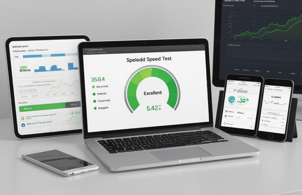
A. Compressing Images Without Sacrificing Quality
Page speed is everything in today’s mobile-first world. And nothing kills load times faster than bloated images.
Most designers make the same mistake: uploading those gorgeous 4000px wide hero images straight from their DSLR. Your visitors’ browsers are screaming in pain.
Here’s the hard truth – you can slash image file sizes by 70% without anyone noticing quality differences. Use tools like ShortPixel or Squoosh that employ smart compression algorithms.
Try this quick test:
- Take your heaviest image
- Compress it to 30% of original size
- View both side by side
- Ask someone which is which
Bet they can’t tell the difference.
B. Implementing Lazy Loading for Faster Initial Load Times
Why load content nobody sees? That’s what lazy loading fixes.
Your visitors care about what’s on their screen NOW, not what’s hiding below the fold. By default, browsers load everything at once – terrible for speed metrics.
Add this simple attribute to your image tags:
<img src="image.jpg" loading="lazy" alt="Description">
That’s it. Modern browsers now postpone loading those images until users scroll near them.
No fancy plugins needed for basic implementation. For more complex scenarios, try Intersection Observer API.
C. Minifying CSS and JavaScript Files
Your code is probably full of spaces, comments, and newlines that machines don’t need. Strip them out.
Minification can reduce file sizes by 25-80% depending on how verbose your original code is. That’s massive.
Tools like Terser for JavaScript and CSSNano handle the heavy lifting. For WordPress sites, plugins like WP Rocket do this automatically.
The performance gains are immediate and significant – especially on mobile networks.
D. Leveraging Browser Caching Effectively
Stop making visitors download the same files on every visit. It’s wasteful and slow.
Browser caching tells visitors’ browsers: “Hey, store this file and don’t ask for it again until X date.”
Add these lines to your .htaccess file:
<IfModule mod_expires.c>
  ExpiresActive On
  ExpiresByType image/jpg "access plus 1 year"
  ExpiresByType image/webp "access plus 1 year"
  ExpiresByType text/css "access plus 1 month"
  ExpiresByType application/javascript "access plus 1 month"
</IfModule>
Set longer cache times for resources that rarely change (images, fonts) and shorter times for things that update more frequently.
Creating Responsive Content That Ranks

Designing Readable Typography Across Devices
Ever notice how some websites are a complete pain to read on your phone? The text is either microscopic or you’re constantly pinching and zooming. Nobody has time for that.
Good typography isn’t just about looking pretty—it directly impacts your SEO. When users bail because they can’t read your content comfortably, Google notices those bounces.
Here’s what actually works:
- Use relative units (em, rem, %) instead of fixed pixels
- Maintain line heights between 1.4-1.6 for optimal readability
- Keep paragraphs short (3-4 lines max on mobile)
- Stick with 16px as your minimum font size
Remember that contrast ratio between text and background? Aim for at least 4.5:1. Your users with vision impairments will thank you, and so will Google’s accessibility algorithms.
Optimizing Video Content for Mobile Users
Video content is SEO gold—when it’s done right. The problem? Most sites just slap desktop videos onto mobile and call it a day.
Mobile users have specific needs:
- Limited data plans
- Smaller screens
- Different viewing contexts (often public, sometimes without sound)
Smart implementation means using responsive video players that automatically adjust to screen size. But don’t stop there. Implement these proven tactics:
- Add captions to all videos (improves accessibility and engagement)
- Create separate thumbnail images optimized for mobile dimensions
- Offer lower-resolution options for data-conscious users
- Keep mobile videos under 60 seconds when possible
The magic happens when you add schema markup to your videos. This gives search engines the context they need to feature your content in video carousels.
Creating Touch-Friendly Navigation Elements
Mobile users navigate with their thumbs, not mouse pointers. Seems obvious, right? Yet most sites still design navigation for desktop first.
The anatomy of touch-friendly navigation:
- Minimum tap target size: 44px × 44px (Apple’s guideline)
- Finger-friendly spacing between elements (at least 10px)
- Position crucial navigation within thumb reach zones
- Implement swipe gestures for common actions
A hamburger menu might seem like the easy answer, but test it first. Many sites see better engagement with bottom navigation bars that keep important links visible and within thumb reach.
Progressive enhancement is your secret weapon here. Build for the smallest screen first, then enhance for larger screens. This approach naturally forces you to prioritize what truly matters.
Mobile-Friendly URL Structures

Implementing Responsive Design vs. Separate Mobile URLs
You’ve got two choices when it comes to mobile URLs, and trust me, this decision matters more than you might think.
Responsive design uses the same URL across all devices. Your site simply adjusts to fit whatever screen it’s on. Google loves this approach because it’s clean and efficient. One URL means easier crawling and indexing.
Separate mobile URLs (like m.yoursite.com) create device-specific experiences but come with baggage. You’ll need proper redirects, canonical tags, and Switchboard tags. That’s a lot of technical overhead just waiting to cause problems.
Here’s what you’re really choosing between:
| Responsive Design | Separate Mobile URLs |
|---|---|
| One URL to maintain | Multiple URLs to manage |
| Simpler SEO implementation | Complex redirect patterns |
| No redirect lag | Potential redirect chains |
| Lower maintenance | Higher technical debt |
Best Practices for URL Parameters in Responsive Sites
URL parameters can tank your SEO if you’re not careful. Those little question marks in URLs? They’re powerful but dangerous.
First rule: Keep parameters minimal on mobile. Every extra parameter slows page load and complicates crawling.
Use these parameter best practices:
- Implement parameter handling in Google Search Console
- Consolidate duplicate content caused by parameters
- Avoid session IDs in URLs for mobile users
- Use hashed URLs (#) for non-essential content variations
Avoiding Common Mobile URL Mistakes
I see these mistakes constantly, even from experienced developers:
- Blocking mobile URLs in robots.txt (huge mistake!)
- Missing redirects between mobile and desktop versions
- Slow redirect chains that kill mobile page speed
- Inconsistent internal linking between versions
- Forgetting to update hreflang tags for international sites
The redirect issue is particularly nasty. Each redirect adds 200-500ms of load time. On mobile, that’s an eternity and potential rankings killer.
Enhancing Mobile User Experience for Better SEO

A. Eliminating Intrusive Interstitials and Pop-ups
Nobody—and I mean nobody—likes tapping on a mobile result only to be smacked with a full-screen popup. Google knows this too, which is why they actively penalize sites with intrusive interstitials.
Want the harsh truth? Your newsletter signup popup is killing your mobile SEO.
Here’s what Google specifically hates:
- Popups that cover the main content
- Standalone interstitials that users must dismiss before accessing content
- Layouts where the above-the-fold portion looks like an interstitial
Instead, try these mobile-friendly alternatives:
- Small, easily dismissible banners
- Slide-ins that occupy less than 15% of the screen
- Exit-intent popups that only appear when users are leaving
B. Designing Thumb-Friendly Tap Targets
Ever tried tapping a tiny button on your phone only to hit something else entirely? Frustrating, right?
Google recommends touch targets be at least 48 pixels tall/wide with adequate spacing between clickable elements. This isn’t just a nice-to-have—it’s a ranking factor.
Make these changes today:
- Increase button sizes to at least 48×48 pixels
- Add padding between clickable elements (minimum 8px)
- Place important navigation in the thumb-friendly zone (middle and bottom of screen)
- Test your site with the “fat finger” approach—can you navigate without mistakes?
C. Optimizing Forms for Mobile Completion
Mobile forms with high abandonment rates send terrible signals to search engines. Users bouncing because they can’t complete your form is an SEO disaster.
Fix your forms with these tweaks:
- Cut unnecessary fields (seriously, do you really need their fax number?)
- Enable autofill whenever possible
- Use appropriate input types (tel, email, date) to trigger the right keyboards
- Break long forms into digestible steps with progress indicators
- Implement inline validation so users know immediately if there’s an issue
D. Reducing Friction in Mobile Conversion Paths
Every tap a user needs to make represents potential drop-off. Search engines track these engagement metrics, and high bounce rates hurt rankings.
Streamline your mobile conversion paths by:
- Reducing the number of steps to purchase/convert to absolute minimum
- Implementing one-click options where possible
- Offering guest checkout (requiring account creation is conversion poison)
- Making contact information tap-to-call or tap-to-email
- Testing every conversion path monthly on multiple devices
Technical SEO Hacks for Responsive Sites:

Implementing Proper Viewport Meta Tags
The mobile experience starts with this tiny line of code, yet I’m amazed how many developers still get it wrong.
<meta name="viewport" content="width=device-width, initial-scale=1">
This isn’t just some random tag – it’s the foundation of responsive design. Without it, mobile browsers render pages at desktop widths and then shrink everything down, creating that frustrating pinch-to-zoom nightmare.
But don’t stop at the basics. Take it further by customizing viewport settings:
- Prevent zooming for app-like experiences:
user-scalable=no - Set maximum/minimum scale:
maximum-scale=2, minimum-scale=1
The key is understanding what your users need. E-commerce? Keep zooming enabled so people can check product details. Interactive dashboard? Maybe limit zooming for a more controlled UI.
Using Structured Data for Mobile SERPs
Mobile search results are prime real estate, and structured data helps you claim more of it.
Google prioritizes rich results on mobile. Think about it – on a small screen, those recipe cards, product ratings, and FAQ dropdowns stand out dramatically.
Here’s what works right now:
| Structured Data Type | Mobile Impact |
|---|---|
| FAQ Schema | Expandable dropdowns = more SERP space |
| Product Schema | Shows price, availability, ratings at a glance |
| Review Schema | Builds trust instantly with star ratings |
| Recipe Schema | Displays cook time, ingredients, calories |
The magic happens when you implement these with JSON-LD (not the outdated microdata). JSON-LD sits cleanly in your <head> and doesn’t mess with your markup.
Optimizing Robots.txt for Mobile Crawling
Your robots.txt file isn’t a set-it-and-forget-it deal anymore – not with mobile-first indexing.
The trick is understanding that Googlebot-Mobile and regular Googlebot need different instructions.
Smart sites now use separate directives:
User-agent: Googlebot
Allow: /

User-agent: Googlebot-Mobile
Allow: /mobile/
Disallow: /desktop-only/
Another game-changer: controlling crawl budget for mobile resources. If you’ve got heavy JavaScript frameworks powering your responsive design, consider these robots.txt tweaks:
- Block unused mobile resources
- Prioritize mobile-specific sitemaps
- Direct crawlers to AMP versions first
Remember when testing: Google Search Console’s URL Inspection tool now shows you exactly how Googlebot-Mobile sees your content.
Local SEO Optimization for Responsive Websites:

Implementing Location-Based Responsive Features
Mobile users searching for local businesses need answers fast. Your responsive website should deliver location-specific content automatically based on where they’re searching from.
Start by implementing geolocation APIs that detect user location and customize content accordingly. When someone in Chicago visits your site, they should see Chicago-specific info without having to dig for it.
Try these quick implementation tricks:
- Add location-based redirects to regional landing pages
- Create dynamic content blocks that change based on user location
- Use structured data markup with local business schema
- Build responsive store locators that prioritize nearby locations
Remember those annoying popups asking for location permission? Make yours worth it. When users share their location, reward them with genuinely useful local content or special offers.
Optimizing Google Business Profile for Mobile Searches
Your Google Business Profile is essentially your digital storefront. When optimized for mobile, it becomes your secret weapon for local SEO.
The stats don’t lie – 76% of people who search for something nearby on their phone visit a business within a day. That’s huge.
Make these mobile-specific adjustments to your profile:
- Upload vertical photos that display well on mobile screens
- Keep your business description short and keyword-rich
- Add attributes that mobile searchers filter by (outdoor seating, free WiFi, etc.)
- Regularly update hours, especially for holidays or special events
Don’t forget to actively respond to reviews from your mobile device. This keeps your profile dynamic and shows Google you’re engaged.
Mobile Map Integration Techniques
Maps make or break the mobile local search experience. Nobody wants to squint at tiny map pins or struggle with directions on a small screen.
Smart mobile map integration means:
- Embedding responsive Google Maps that resize beautifully
- Adding custom-designed map markers that stand out on small screens
- Implementing one-tap directions that launch the user’s preferred map app
- Creating map filters that work with touch interfaces (not tiny checkboxes)
Test your map functionality on multiple devices. That perfect map experience on your iPhone might be a frustrating mess on an Android tablet.
Mobile users have zero patience for clunky maps. If they can’t quickly figure out where you are and how to get there, they’ll bounce to a competitor faster than you can say “recalculating route.”
Testing and Monitoring Responsive SEO Performance:

Tools to Verify Mobile-Friendliness
You’re kidding yourself if you think you can eyeball mobile-friendliness. I’ve seen too many designers say “it looks fine on my phone” only to watch their rankings tank.
These tools take the guesswork out:
- Google’s Mobile-Friendly Test: The gold standard. It’s like getting feedback directly from the search giant itself.
- PageSpeed Insights: Gives you mobile performance scores and actionable fixes.
- BrowserStack: Test on actual devices without buying 30 phones.
- Screenfly: Quick visual checks across multiple screen sizes.
No excuses here. Run these tests weekly, not just at launch.
Tracking Mobile vs. Desktop Rankings Separately
Mobile rankings ≠ desktop rankings. Period.
Most SEO pros miss this completely. They check desktop rankings, see everything’s peachy, then wonder why traffic is down.
Set up separate tracking for:
- Mobile SERPs (often show different features)
- Local results (way more prominent on mobile)
- Position changes (keywords that rank #3 on desktop might be #9 on mobile)
Tools like SEMrush and Ahrefs let you filter by device. Use them.
Setting Up Mobile-Specific Analytics
Generic analytics are useless for responsive design. You need granular data.
In Google Analytics:
- Create separate segments for mobile, tablet, and desktop
- Set up custom reports for mobile conversion paths
- Track mobile-specific engagement metrics (scroll depth matters more on phones)
- Monitor mobile page load times (each second costs you 20% of users)
The gold is in comparing behaviors. When mobile users bail on pages desktop users love, that’s your responsive design failing.
A/B Testing for Mobile Conversion Optimization
Stop guessing what works on mobile. Test it.
Mobile optimization is brutally specific:
- Button size (fat fingers need bigger targets)
- Form length (each field you remove doubles completion rates)
- Content length (mobile users skim differently)
- Call-to-action placement (above the fold means something different on phones)
Run focused tests on high-traffic pages first. Small tweaks often produce shocking results – I’ve seen conversion jumps of 200%+ from simply changing button placement on mobile.
The winning formula? Test weekly, implement fast, and never assume desktop success translates to mobile.
Advanced Schema Markup for Mobile Results:

Implementing Rich Results for Mobile SERPs
Think mobile users are patient? Think again. They want answers FAST.
That’s where schema markup becomes your secret weapon. By adding structured data to your mobile pages, you can score those eye-catching rich results that dominate mobile searches.
Here’s what actually works:
- Focus on mobile-specific rich results like:
- Local business info (opening hours, directions)
- Product ratings (stars grab attention on tiny screens)
- FAQ dropdowns (saves precious screen space)
Most developers stop at basic schema. Big mistake. The magic happens when you layer multiple schema types. A restaurant can combine LocalBusiness, Menu, and Review schemas for a complete mobile presence.
{
  "@context": "https://schema.org",
  "@type": "Restaurant",
  "name": "Milano's",
  "aggregateRating": {
    "@type": "AggregateRating",
    "ratingValue": "4.8"
  },
  "hasMenu": {
    "@type": "Menu",
    "hasMenuSection": {...}
  }
}
Voice Search Optimization Through Schema
Voice search isn’t the future—it’s already here. And guess what powers those voice responses? Often, it’s your schema markup.
When someone asks their phone “when does the gym close?” you want YOUR gym as the answer. SpecialAnnouncement and OpeningHoursSpecification schemas are goldmines for voice queries.
The trick is thinking in questions and answers:
- Use Question and Answer schema for FAQs
- Include complete sentences in your markup
- Target natural language patterns
What most SEOs miss: voice results pull from Position Zero results, which heavily favor properly structured data. Test your markup with Google’s Rich Results Test specifically on mobile settings.
Event and Product Schema for Mobile Users
Mobile users searching for events or products are typically ready to act NOW. Your schema needs to match this urgency.
For events, include:
- EventStatus (especially for last-minute changes)
- VirtualLocation (for hybrid events)
- TicketAvailability (creates urgency)
For products, these schema elements convert like crazy on mobile:
- Availability
- DeliveryTime
- Price with PriceValidUntil
The coolest hack? Combining Product schema with Offer schema to show limited-time discounts directly in search results. This creates that perfect FOMO trigger for mobile shoppers.
Remember to test everything on actual mobile devices. What looks perfect in testing tools sometimes breaks on real-world phones. And mobile-first indexing means Google primarily sees your site through its mobile crawler—so make those schemas shine!
Future-Proofing Your Responsive SEO Strategy:

Preparing for Core Web Vitals Updates
The web doesn’t sit still, and neither should your responsive design strategy. Google keeps moving the goalposts with Core Web Vitals, and smart SEOs are already prepping for what’s next.
Here’s the truth – most sites still struggle with the basics like LCP, FID, and CLS. But just meeting today’s standards isn’t enough.
Want to stay ahead? Start tracking your Core Web Vitals weekly, not monthly. Notice patterns. Is your LCP creeping up? Are those fancy new images crushing your load times on mobile? Fix issues before Google penalizes you for them.
Smart move: create a performance budget for each device type. Mobile gets the strictest limits because that’s where most users struggle.
Device Type | Max Page Size | Max HTTP Requests | Target LCP
-----------|---------------|-------------------|----------
Mobile     | 1MB           | 50                | <2.5s
Tablet     | 1.5MB         | 60                | <2.5s
Desktop    | 2MB           | 70                | <2.5s
Adapting to Voice Search Through Responsive Design
Voice search isn’t just coming – it’s already here, reshaping how people find you.
Think about it: nobody talks to Siri or Alexa with “responsive web design optimization techniques.” They ask, “How do I make my website look good on phones?”
Your responsive design needs to answer these conversational queries. This means:
- Creating FAQ sections with natural language questions
- Structuring content to directly answer specific questions
- Using schema markup to help search engines understand your content
The magic happens when your responsive design delivers these voice-friendly answers in a mobile-friendly format. Quick-loading, easily scannable content wins the voice search game.
Pro tip: Test your site with screen readers. If it sounds awkward or robotic, your voice search optimization needs work.
Implementing AMP Strategically
AMP isn’t the golden child it once was, but it’s far from dead. The key is being strategic about where and how you use it.
Don’t AMP your entire site – that’s outdated advice. Instead, identify your high-traffic, time-sensitive content where speed truly matters:
- News articles
- Product pages during flash sales
- Event landing pages
For these pages, AMP can still deliver serious benefits. But here’s what most people miss – you need different analytics tracking for AMP versus non-AMP pages to truly understand performance differences.
The real trick? Use AMP as one tool in your responsive toolbox, not the entire solution. Many sites see better results with a hybrid approach:
Content Type | AMP Strategy | Responsive Strategy
-------------|--------------|--------------------
Blog Posts   | AMP         | Detailed imagery, interactive elements
Product Pages| Standard    | Full responsive experience with all features
News Updates | AMP         | Speed-optimized, minimal JS
Optimizing for Emerging Mobile Technologies
The mobile experience goes way beyond just smaller screens now. Foldable phones, AR capabilities, and variable refresh rates are changing how users interact with your site.
Progressive Web Apps (PWAs) are becoming the gold standard for mobile-first sites that need app-like functionality without the app store hassle.
What’s flying under the radar? Device orientation features. Sites that smoothly transition between landscape and portrait modes without losing functionality score huge points with users.
And don’t sleep on haptic feedback. Adding subtle vibrations to confirm actions like form submissions or adding items to cart can boost conversion rates by making interactions feel more tangible.
Testing on actual devices matters more than ever. Emulators can’t replicate the experience of using a folding Galaxy Z Flip or the unique display characteristics of the latest iPhone Pro.

Mastering responsive web design is no longer optional in today’s mobile-dominated digital landscape. By implementing the ten SEO hacks outlined above—from optimizing page speed and creating responsive content to enhancing mobile user experience and implementing advanced schema markup—you can significantly improve your website’s search engine rankings while providing visitors with a seamless experience across all devices.
Remember that responsive SEO is an ongoing process rather than a one-time task. Regularly test your website’s performance, stay updated with algorithm changes, and continuously refine your approach based on analytics data. By prioritizing both technical excellence and user experience in your responsive design strategy, you’ll position your website for sustainable search visibility and competitive advantage in an increasingly mobile-first world.